Color notes: Boulder Barrel Project

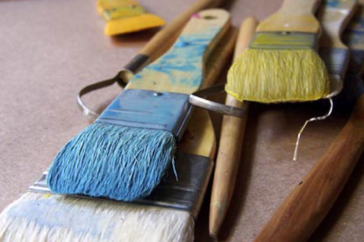
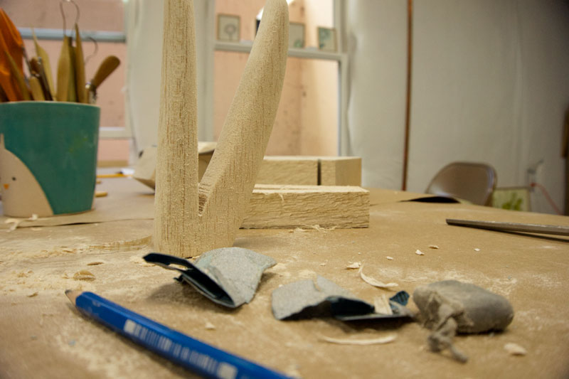
One of the things I go for in my work is a sense of ease.  I want it to look like it breathed itself into being which, counterintuitively, takes a degree of planning to pull off consistently.  While every project is different, planning for me can include thumbnail sketches, doing materials tests, color tests and cutting/collage exercises to help work out ideas about composition.


Here are some of my color notes for the Boulder Barrel Project.  I chose Mars yellow, transparent red iron oxide, titanium white and green gold for this project after spending time looking at neighborhood architecture and landscaping in Boulder, Colorado where my barrel will most likely end up sited.  Accent colors are still up for grabs and could include raw umber, teal and magenta. I’m using Golden acrylics, a mix of heavy body, fluid and high flow paint.

BBPSwatch1

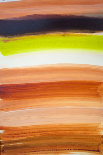
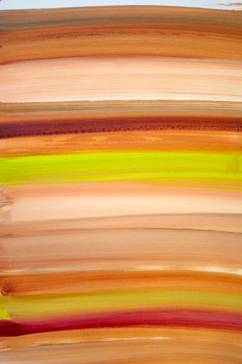
Still on the fence about raw umber.  But the Mars yellow, transparent red iron oxide, titanium white and green gold, all special favorites, are keepers, for sure.

BBPSwatch2

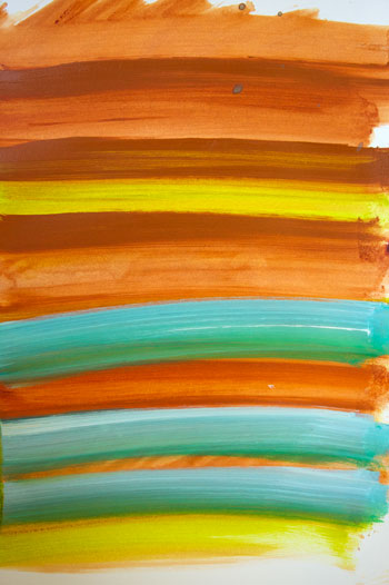
While teal is a natural complement to terra cotta, I’ve decided not to use it for this project because the combo reads too tritely Southwest to me.

BBP3Swatch

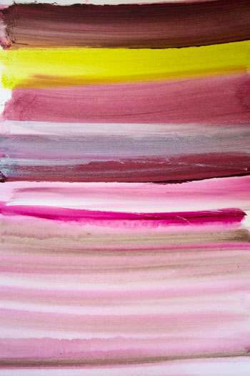
Contemplating magenta.  Do I like what it adds to the palette?  Or, all of a sudden, are we looking at too many colors here?

BBPSwatch4

Ooh, I like the deepening that happens when transparent red iron oxide mixes with magenta. So I will keep magenta on board as a mixing color.

Troublemakers: the Story of Land Art

OK, here is another movie recommendation for you: Troublemakers: the Story of Land Art.   If you are interested in environmental art and the American West, this is one to put on your list.  What’s great about it: historical interviews with artists and footage of land art being excavated and built.

What’s weird about it: the lack of contemporary interviews with the film’s most noted artists (many of whom are deceased).  Troublemakers relies heavily on interviews with people who knew them, which while interesting, aren’t the same as hearing from the artists themselves.


Interact with Robert Smithson’s Spiral Jetty and other remotely sited pieces (and plan your land art road trip) on Google maps.


Spiral Jetty by Robert Smithson.

Screen Shot 2016-07-26 at 2.55.19 PM

Sun Tunnels by Nancy Holt.

Screen Shot 2016-07-26 at 3.01.38 PM

Double Negative by Michael Heizer.

Screen Shot 2016-07-26 at 3.08.54 PM

Lightning Field by Walter De Maria (reservations required).

Screen Shot 2016-07-26 at 3.18.52 PM

Only Lovers Left Alive and Big Magic

Over the weekend I finally got to watch Jim Jarmusch’s 2014 vampire flick, Only Lovers Left Alive and wholeheartedly recommend.  It’s fun to watch these two beautifully attired vampire lovers played by Tilda Swinton and Tom Hiddleston speed reading, listening to records, lounging around and basking in each other’s company.


Screen Shot 2016-07-19 at 2.34.43 PM

Alas, Big Magic in its beautiful dust jacket failed to conjure much for me.

I only mention Only Lovers because my experience watching it put me so much more in the mood to consider art than Elizabeth Gilbert’s 2015 creativity book, Big Magic.  I started Big Magic last week, am still reading, and frankly finding it depressing because of all the tough-love advice nuggets like, “Get a job!” “What’s your favorite flavor of shit sandwich?” and, “Please try to relax.”  Anyhoo, while I like art and creativity books in general, and am one of those people who loved Gilbert’s bestseller, Eat Pray Love, Big Magic isn’t speaking my language.  That’s OK.  Plenty of other books do.  People seeking constructive advice geared toward helping you move forward with creative work in the face of fear, procrastination and perfectionism, I recommend Sam Bennett’s, Get It Done.

Summer Yarrow

Noodling around with some ideas about theme and composition for the Boulder Barrel Project.  Here are some updated pictures of the Winter Yarrow I posted about back in January.

SummerYarrow1

Summer yarrow blossoms, July 2016, Boulder Colorado


SummerYarrow2

Using a white sheet as a backdrop here do differentiate the blossoms from their background.


SummerYarrow3

Most of our yarrow is white but some of it blushes pink, like someone just tossed of a jar of paint onto the garden as they were walking by.


Boulder Barrel Project

On August 10th of this year it will become legal for people to collect rainwater on their property in Colorado.  To celebrate and raise awareness I will paint a rain barrel as part of the Boulder Barrel Project, a community art project in Boulder, Colorado.  I don’t often do community art projects.  But something about this one sparked my curiosity so I answered yes right away without knowing what sort of barrel I’d be working on.  Organizers have sent two photos.  The classy looking barrel on the left is apparently a no-go.  (OK by me, attempts to stay classy deaden creativity.)  The clunky-bumpy barrel on the right, or something similar to it, is the one I expect to receive and will be working on this July.

Barrel1Barrel2


My challenge is to make something on this utilitarian substrate that I am happy to show, something that connects to my art but that isn’t exactly art (this is more of a design project, really) that will also make sense in the lawn or garden setting where it will eventually go.

Complementary gig

Like many artists, I make ends meet doing a variety of things.  The goal for me (and it’s an elusive one) is to balance income with studio time.  Since I prefer setting my own hours as opposed to logging time at an away-from-home, away-from-studio workplace each day, freelance work that I can do at my own pace works for me.  It doesn’t work for everyone.  Some people prefer a more regular gig outside the home with set hours.  Or something more social.  The key is to know yourself enough to know what works best for you.


Anyway, I’m happy to announce I’ve added a new freelance gig to my mix, writing about bees for the bimonthly mag, Countryside & Small Stock Journal.  My first piece about honey and veganism, July/August 2016, is out now.  So far I’m enjoying the writing and believe it’s added something, a different energy and style of thinking, to what I do in the studio.  I see it as a complementary as opposed to a draggy gig.

Spring beehive in a grassy field, Boulder, Colorado

Spring beehive in a grassy field, Boulder, Colorado


Work in Process


Studio1

Work in process: this 3-d piece, based on an idea/memory of the painting below, is an ingredient in the new series of photographs I’m making titled “Future Perfect.”


Walking-Stick-on-maple-shelf

“Walking Stick,” encaustic and ink on panel, 5″ x 4″


Studio2

Wood chips on floor.


Art and Entertainment

The line between art and entertainment can be hard to draw.  It’s actually easier to say what art has in common with entertainment than what makes it different.  They’re both diverting. They’re both cultural products.  The differences, I think, have to do with intention, context, and the feeling produced in the viewer.  Art offers something extra in that realm.  Sometimes it produces an inchoate yearning that has to do with your potential as a human being.  Or maybe it evokes awe, or startles you, or is weird.  Whatever the feeling you get from it, art gets under your skin.


The Knick, a TV show directed by Stephen Soderbergh, is piece of entertainment that feels like art to me.  It has atmosphere.  The cinematography is intimate.  The sound design, modern, driving.  The editing, sensitively done.  None of the trailers I’ve see for it do it justice.  But here is one . . .